My Guide to Interior Paint
Hey guys! I know how hard picking a paint color can be especially with the infinite amount of choices out there. After painting dozens of rooms, and picking the wrong color several times, I’m going to share a few tips that I’ve learned along the way on how to make one of the hardest decisions…Choosing a paint color!
Pick your paint last - since there is so much versatility in paint, waiting to choose the paint until the end will help determine what undertone you’ll need in your paint color. Plus, you can also make sure its going to go well with your furniture and decor.
Use samples to swatch your walls- it is important to test how the light affects the color at different times of the day. Pick up some samples of colors your leaning towards and paint them directly on your walls to make sure you like how the color transitions throughout the day.
Pick the right sheen- I really prefer to use a flat finish for my walls because I think it gives them an expensive and luxurious look. For the trim I suggest a satin finish for durability. Tip: The higher the finish the more durable your paint will be.
Balance with neutrals- If you decide to go with a bold color, make sure you balance with a neutral in your decor to calm the space.
Natural Tan SW 7567 by Sherwin Williams (Flat)
This is my FAVORITE neutral wall color. I actually like it more than the Villa Grey in my living room. It’s the perfect tan and looks and feels very elevated and calming.
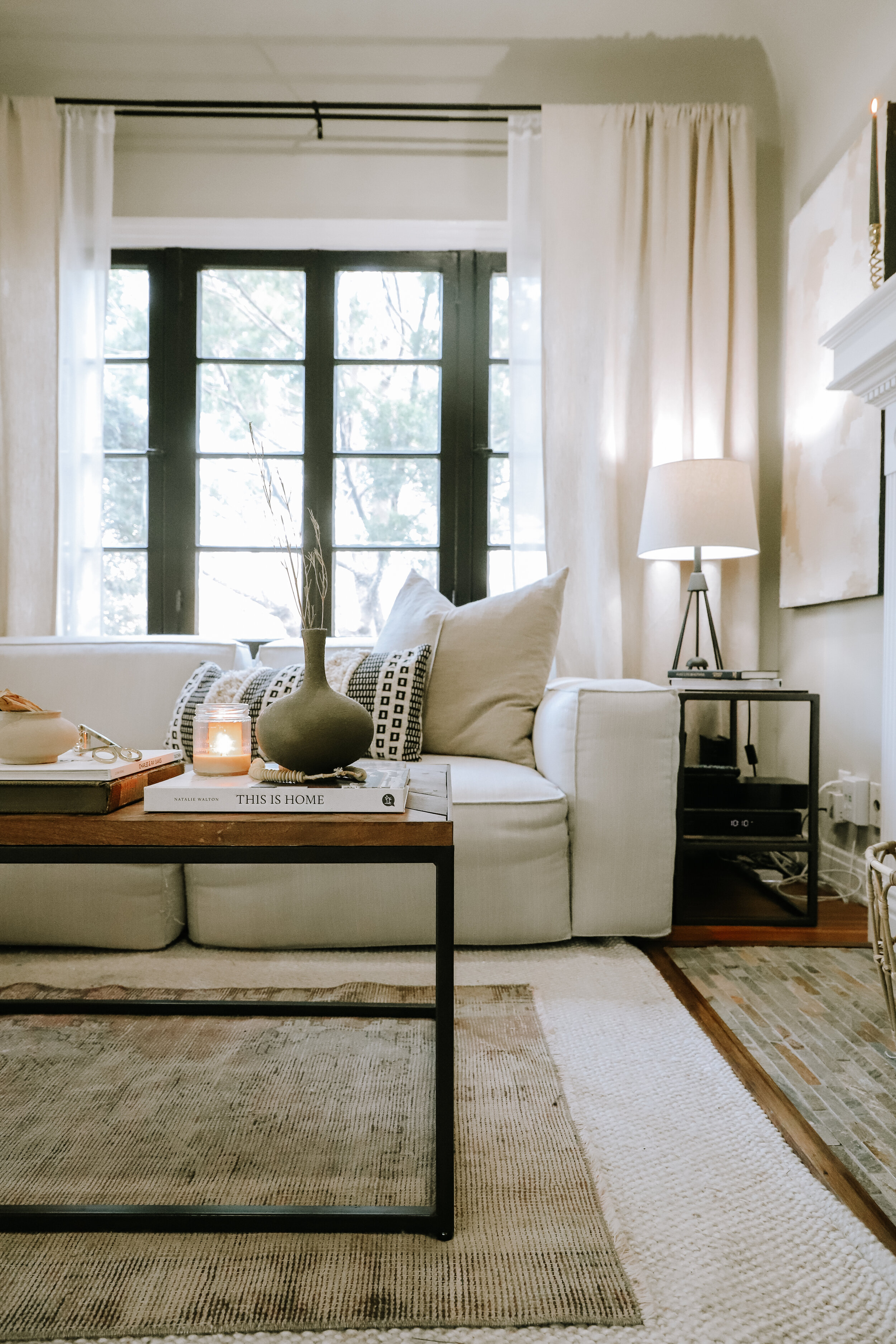
Villa Grey 6005-1B by Valspar (Flat)
I also used this color for my living room. It a great neutral paint, but has a slight green undertone, It’s a subtle green, but surprisingly compliments a lot of decor like the tile in my fireplace.
Tricorn Black SW 6258 by Sherwin Williams (Satin)
I used this for the trim for my living room windows - it is such a great true black hue and perfect in a higher sheen like satin for durability.
Walls- Dove Wing (Flat)
Trim- Mopboard Black (Satin)
Both By Benjamin Moore
This white has a warm yet ashy grey undertone but is also bright so that the space felt open when paired with darker furniture.
The trim color is amazing. It goes on a dark teal blue color but once its second coat dries it is the perfect black.
Chantilly lace by Benjamin Moore
(Eggshell)
Chantilly lace is my go-to “white-white” and it was the perfect color for my DIY shiplap wall for this bathroom. I used the color Deep Caviar by Benjamin Moore for the faux ship lap lines. Watch the video for this DIY here.
Balboa Mist OC-27 by Benjamin Moore (Eggshell)
This light cool grey set the perfect tone for a bohemian style room and made the space feel calm and inviting.
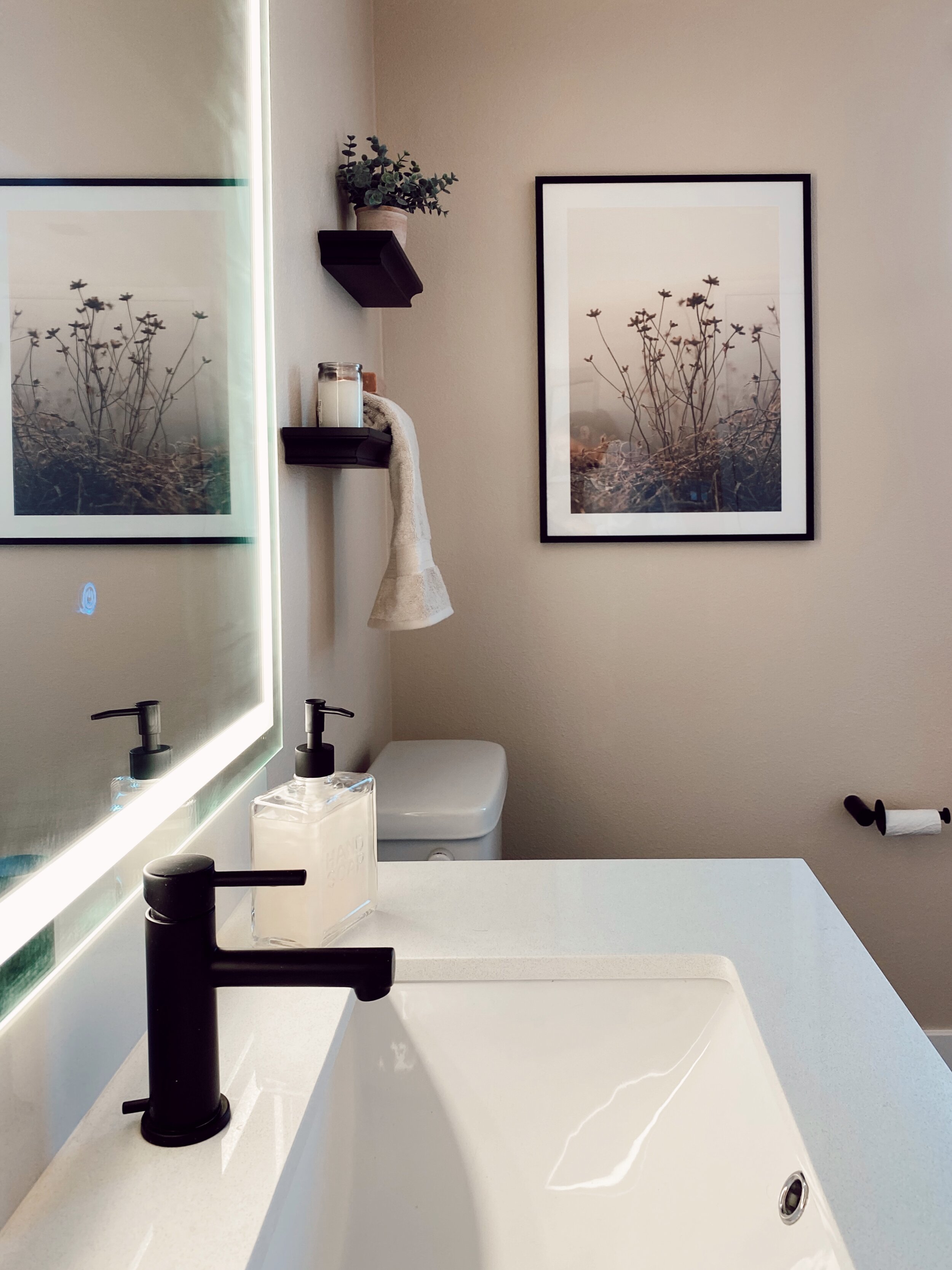
Brandy Cream 1030 by Benjamin Moore (Eggshell)
I know not everyone is into beige walls but the previous white walls in this bathroom were just too sterile. This beige has an ashy undertone and added so much warmth and style into this small bathroom.
Quiet Moments by Valspar (Eggshell)
This is a more feminine beige with a slight pink undertone. It pairs nicely with the black decor accents in this guest room.
Smoky White BWC-13 (Eggshell)
We sampled so many colors for this room and everything kept turning blue or green until we found this one that had a slight yellow undertone. It is the perfect ashy white for a California inspired coastal bedroom.


